SNACK SHOP APP
As part of my Google UX program, I am designing a food app for a theme park snack shop.
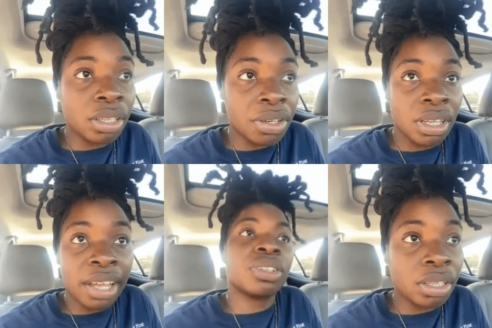
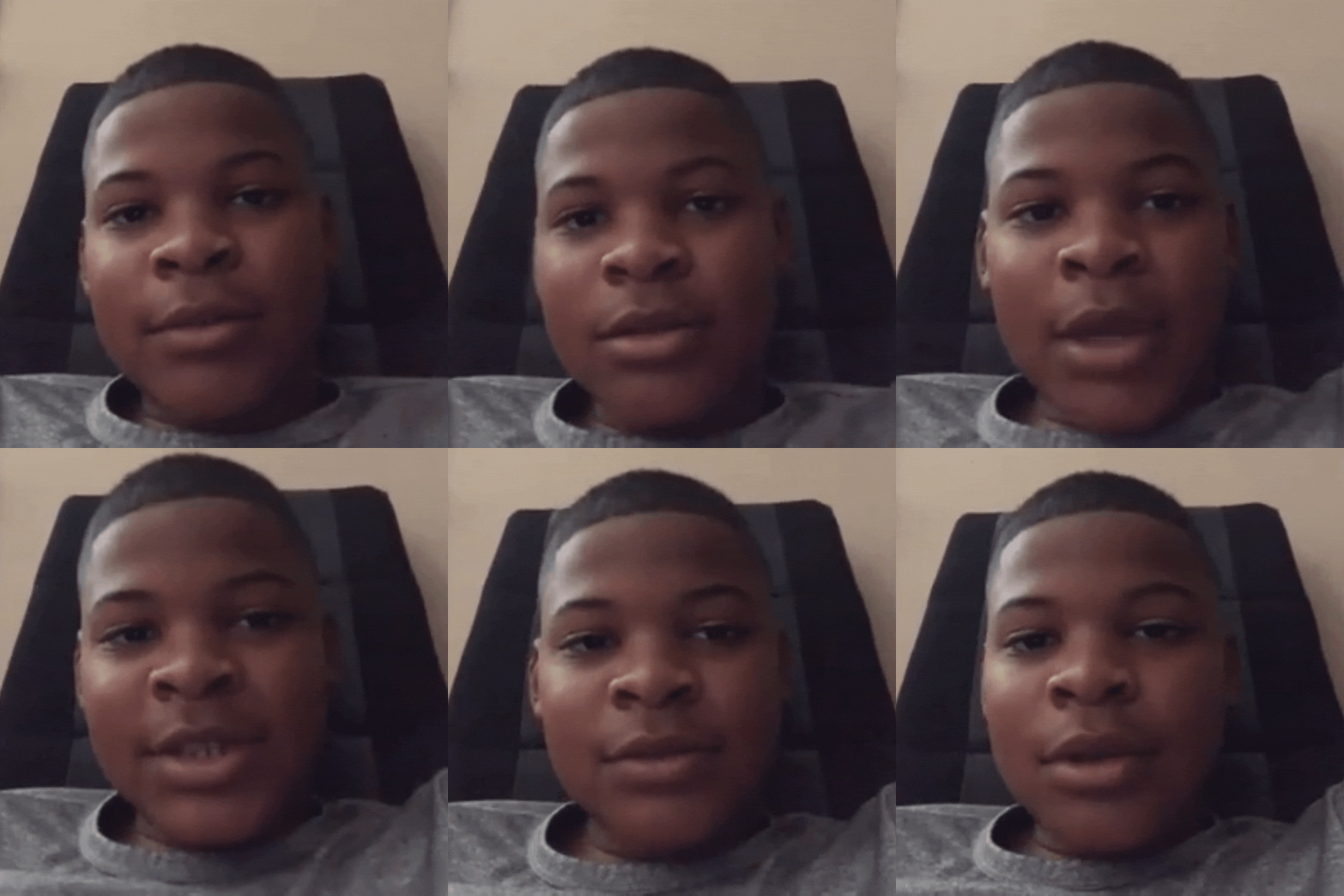
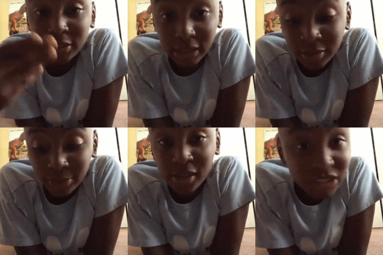
To start, I interviewed four users and created the following personas based on our conversations...

.png)
The adult persona, Kendra, was a combination of two users (a teacher & a family man).
Both of whom have chaperoned their own and/ or other kids to the park.

The child profile, Brandon, was a blend of two preteen interviewees.
Both a little picky and reluctant to talk to park staff.
01
TIME
03
COST
02
TASTE
04
COORDINATION
My exercise was to focus on one persona, so I ultimately decided to focus on Kendra, the adult persona.
Why?
Kendra had more a diverse set of pain points..
a more intricate user journey...
and, as the adult, more decision-making power in the ordering process.
Based on the user journey map, the out-of-app preordering experience was about 15 steps long and overly complicated.
But I also needed to test the quality of existing in-app experiences, so I performed a competitive audit.
.png)
Using some combination of the App Store and Google, I found my first three competitors.
_edited.jpg)



All competitors' target audiences were families, so I choose Dave & Buster's because it was the only competitor also advertising to adults.
Ultimately, I ended up with 2 theme parks and 2 entertainment centers as my competitors:
Six Flags,
Hershey Park,
Chuck E. Cheese,
and
Dave & Buster's
You can find the full version of my audit here...
.png)
.png)
.png)

-1.jpg)
I identified three major gaps:
-
Most competitors did not provide menu options that appeal to adults nor full access to menus,
-
All competitors failed to provide in-app translations,
-
And with the exception of Chuck E. Cheese, the competing apps do not include a preorder feature that works outside the park/ center
And three offerings the shop app could address include:
-
A way for users to view the menu and preorder,
-
More menu options that appeal to adult visitors,
-
And translations in multiple languages

_PNG.png)
Having struggled with navigation on competing apps, I also wanted my user flow to be very simple.
.png)

I wanted to reduce users' stress and provide an enjoyable app experience.

To get improve the user flow and experience, I did the following:
Added a notification button, menu, and preordering feature
allowing users to avoid long lines & excessive waiting
10241024_1_edited_e.jpg)
A filter button
for an easy way to filter out common allergens and find adult-friendly menu items
Dining deal tab
so users don't have to rely on park staff to get desired information
Taking all my research into consideration, I created a set of 6 wireframes and noted some areas for improvement.
(Not written: "add quantity" and "order" CTA buttons in the menu)
10241024_1_edited_e.jpg)
10241024_1_edited_e.jpg)
10241024_1_edited_e.jpg)
10241024_1_edited_e.jpg)
10241024_1_edited_e.jpg)
10241024_1_edited_e.jpg)
10241024_1_edited_e.jpg)
Next, I will be refining my wireframes on Figma. I am excited to share more soon!